Set Up Menu
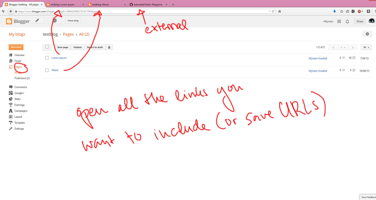
The menu is a simple html list and very easy to set up. Start by opening up every link you need in a new tab or just save them somewhere
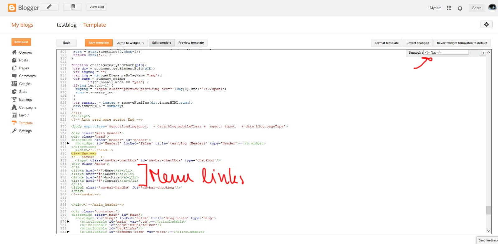
Geht dann ins HTML und sucht nach
<!-- Nav -->Open your HTML and search for
<!-- Nav -->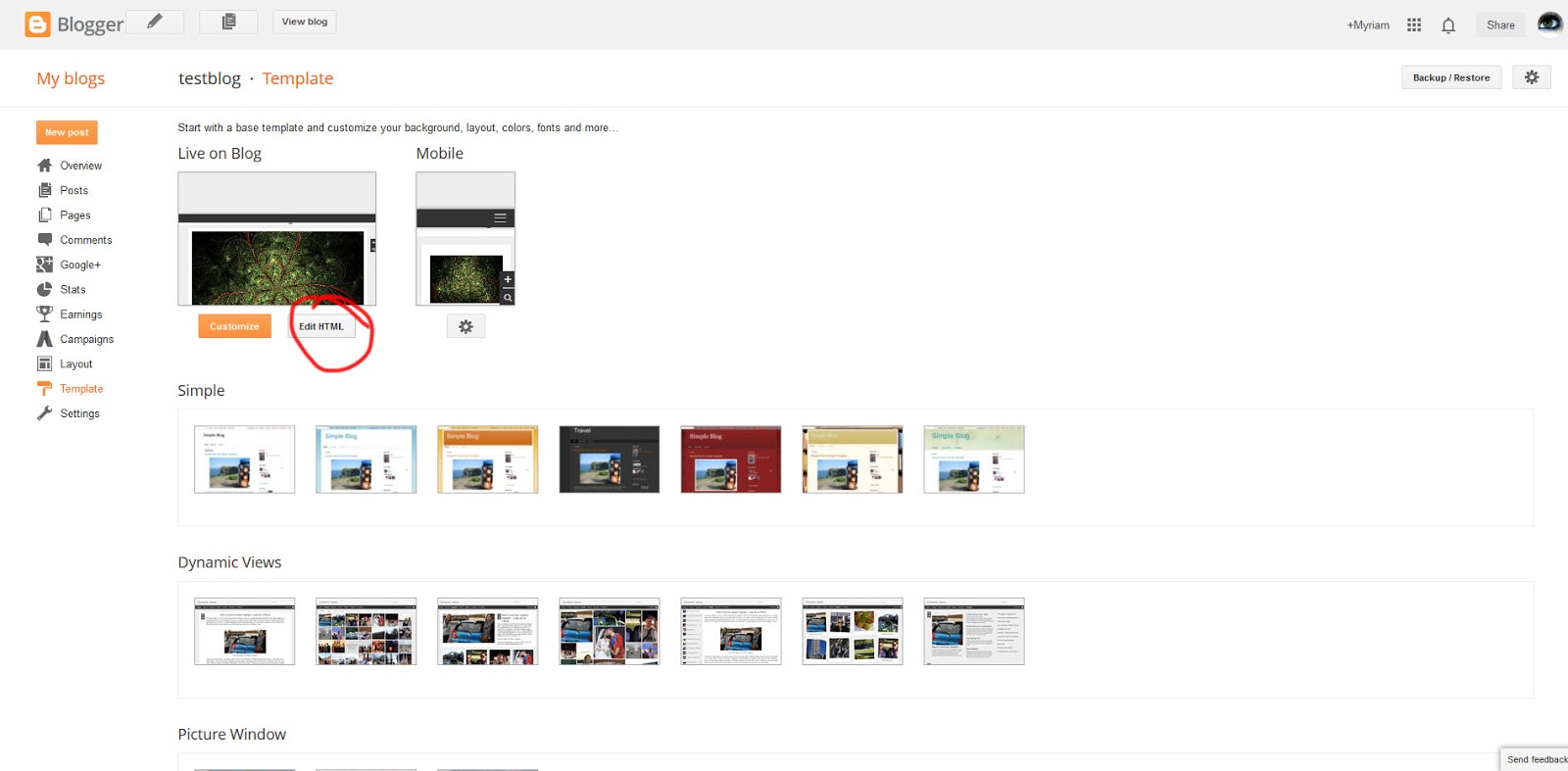
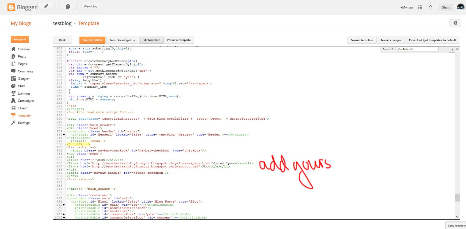
Unten drunter fügt ihr dann eure Links ein.
Underneath you'll add your links
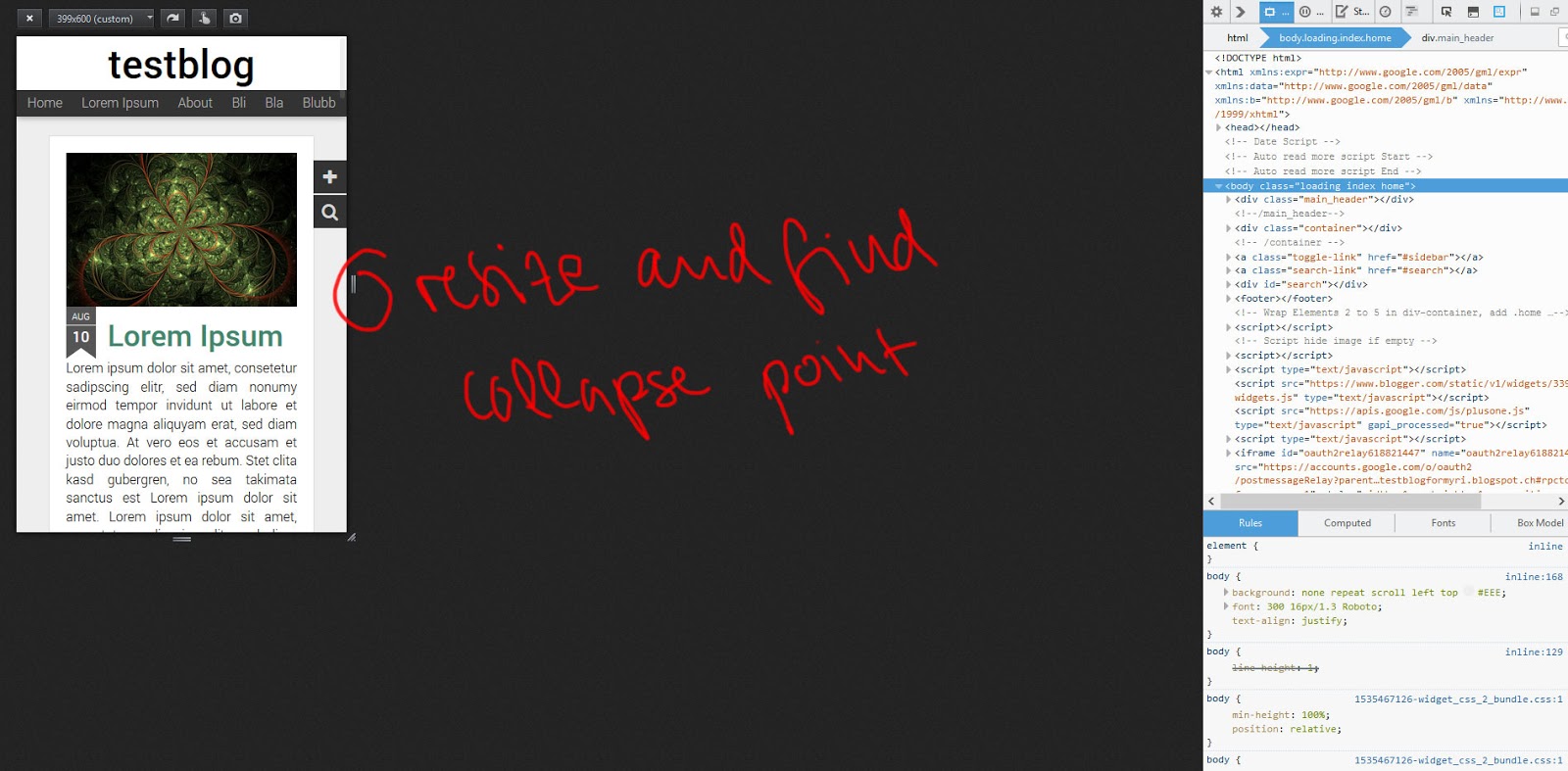
Für den nächsten Schritt müsst ihr den Collapsepunkt berechnen. Ich habe Chrome und Opera getestet, doch beide scheinen diese tolle Firefox-Funktion nicht zu haben, also für diesen Schritt am einfachsten Firefox verwenden, oder Browserfenster verkleinern und dann nachmessen, wie viele Pixel das waren.
For the next step we need to find a collapsepoint for the responsive menu. I checked chrome and opera, but both seem not to have this really great firefox function that I will be using, so get firefox or resize your browserwindow and measure the pixels.
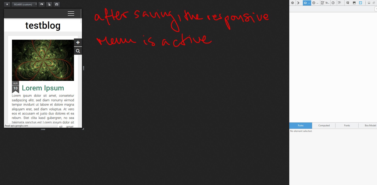
Define when to collapse Menu
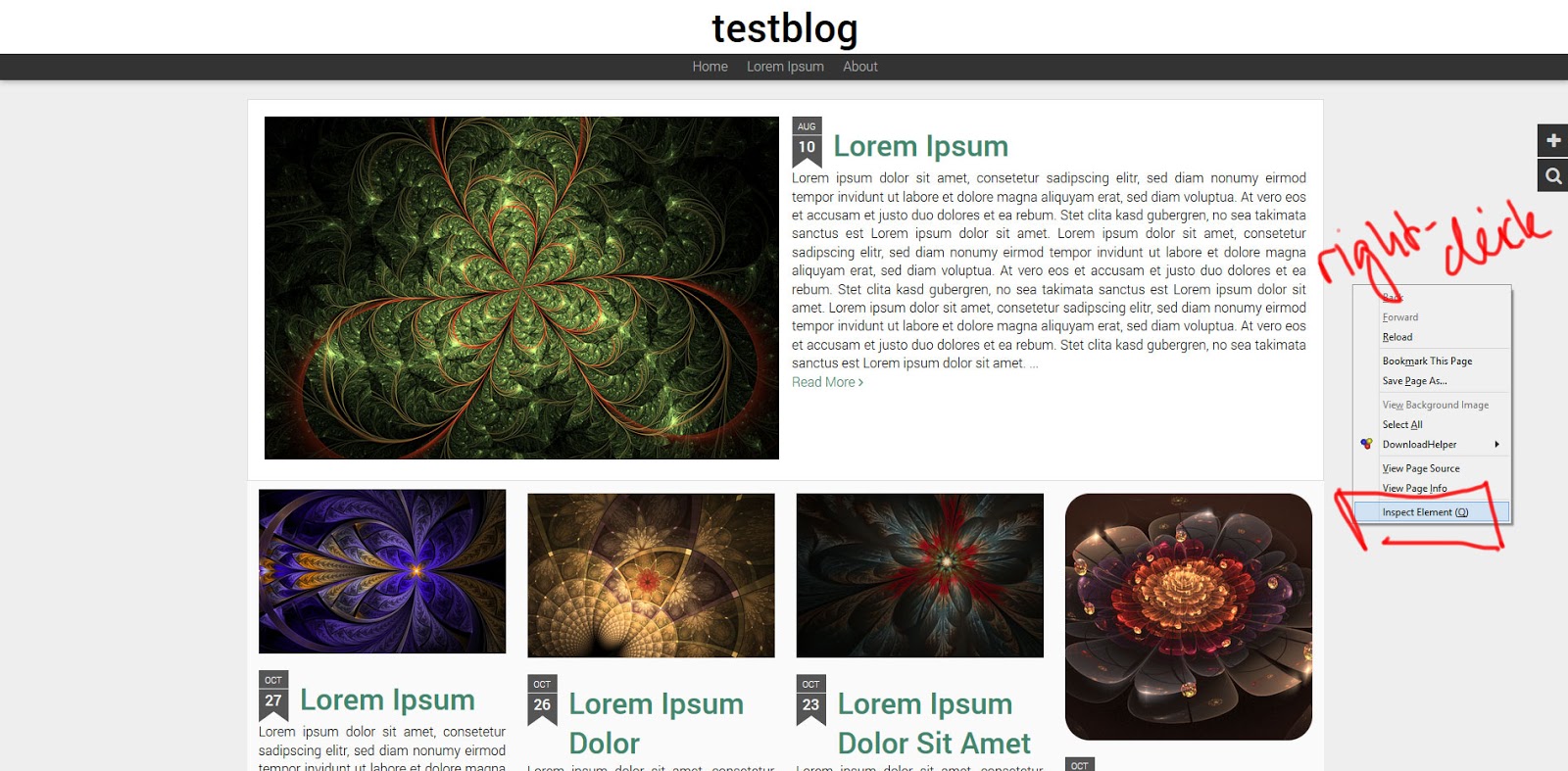
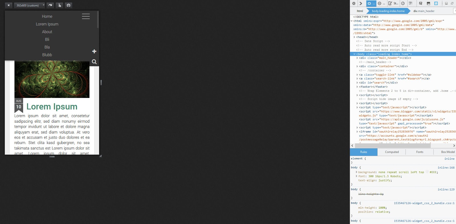
Okay, rechtsklick und dann Element untersuchen auswählen.Okay, right-click and then choose inspect element
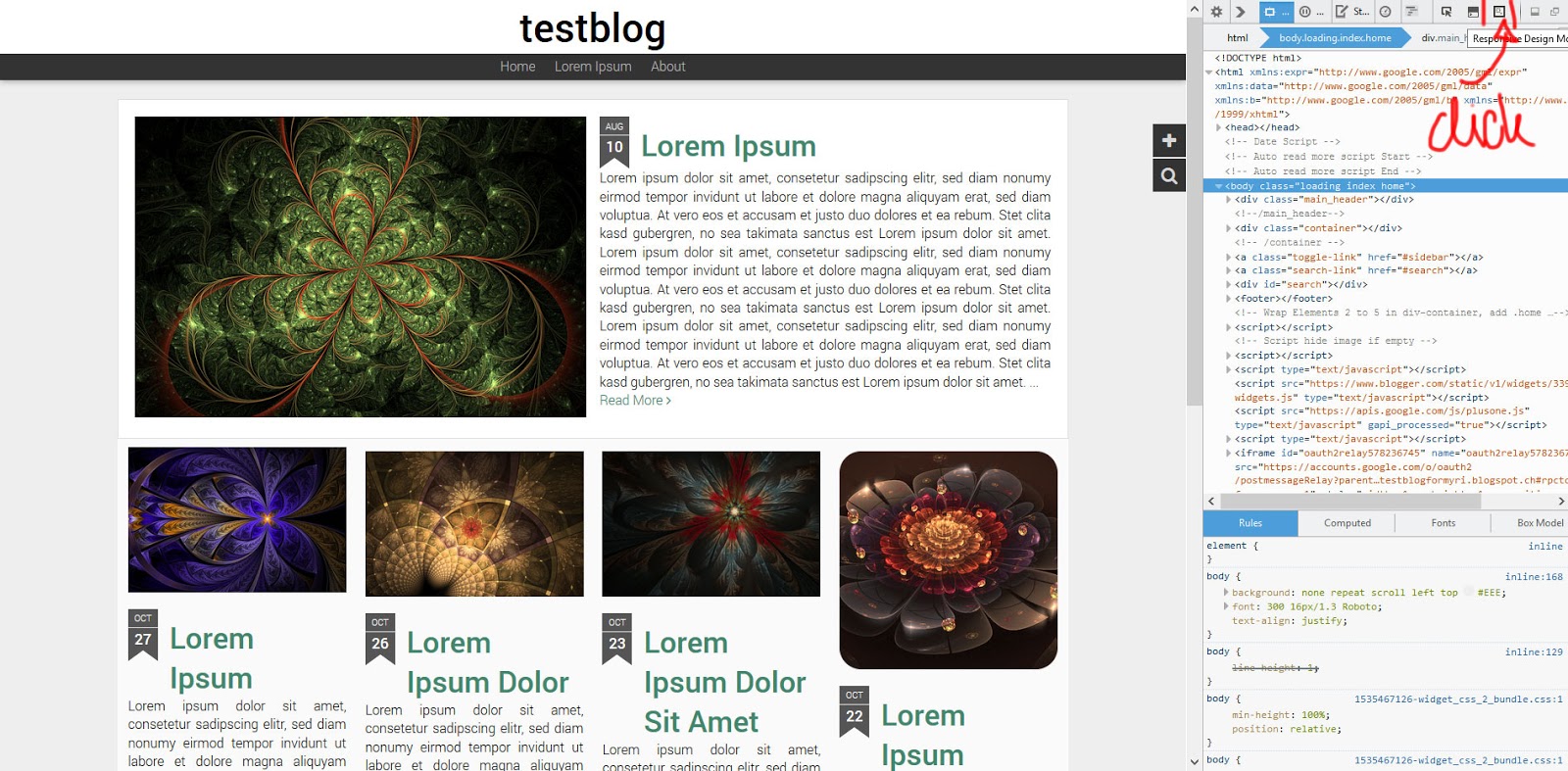
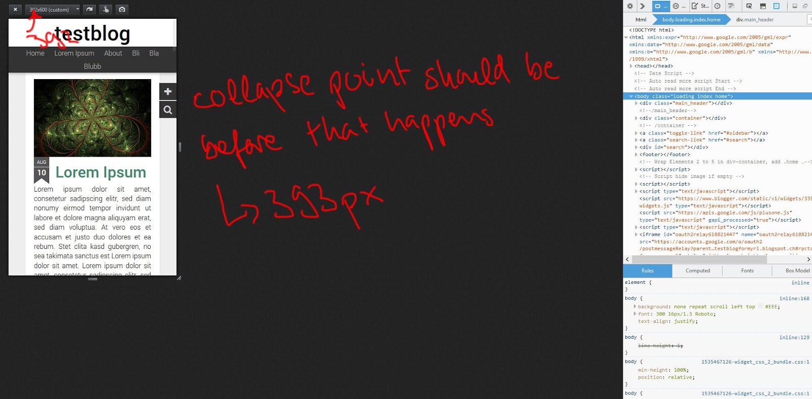
Der Code öffnet sich (entweder rechts oder unten) und dann könnt ihr in der oberen Leiste das Symbol auswählen, das ich im Bild markiert habe. Dort könnt ihr euren Blog responsive ansehen, mit verschiedenen Bildschrimgrössen. Die Seiten lassen sich zusammenschieben und oben seht ihr wie viele Pixel das sind. Ihr schiebt das so lange zusmamen, bis das Menu auf zwei Zeilen ist. Diese Zahl merkt ihr euch. Ihr braucht für den collapse point also etwas, dass ein kleines bisschen grösser ist.
The code pops open (right or at the bottom) and you can choose the symbol I marked in the picture. Thhere you can see your blog responsively, and Firefox will tell you the resolution. You can move the sides. You want to reduce the width until the menu breaks into two lines. The collapse point you need is a little bit bigger than that.
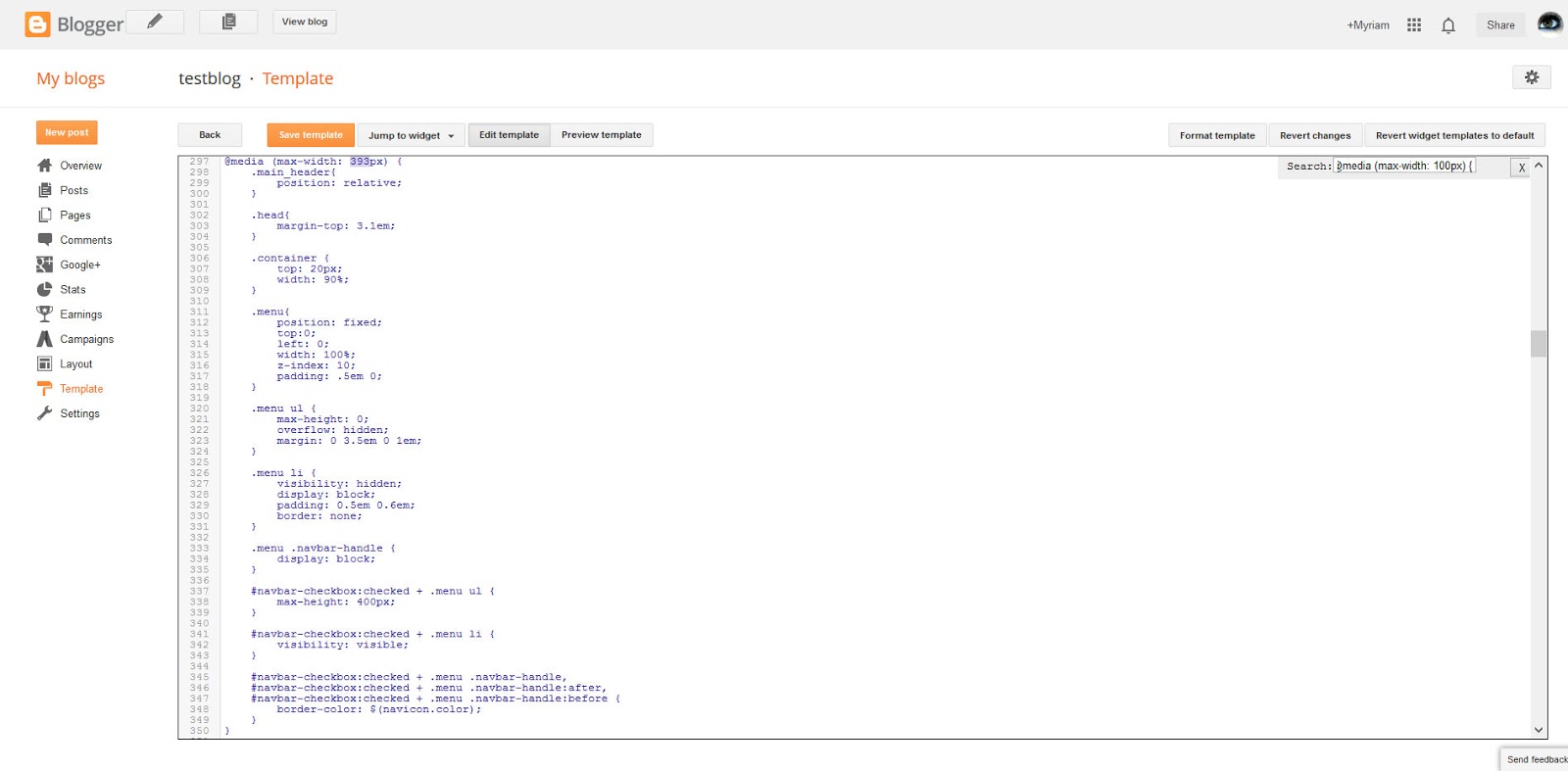
Geht in den Code uns sucht dann nach dem Media Query, dass den Wechsel einläutet. Dann gebt ihr dort euren Wert an. (und testet dann noch einmal mit firefox ob's funktioniert hat)
Open your HTML and search for the media query at which point the mobile menu will be displayed. Add your number (and check in firefox to see if it works)
@media screen and (max-width: 100px)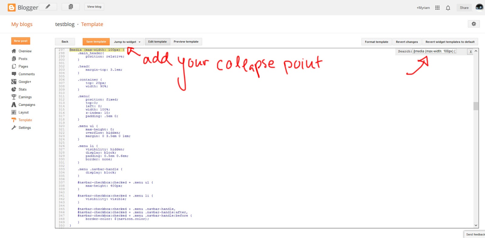
No comments:
Post a Comment